ByeBye-FEVER


Taking Relatable to a Whole New Level
How we help ByeBye-FEVER
redefine its communication and gain more awareness
through emotional stories of motherly love.
B2C, Healthcare
Digital Strategy
Content Production
Articles
Social Media
Analytics
Community Management
Social Care
The Challenge
ByeBye-FEVER is the pioneer for fever compress patches made by Hisamitsu, Japan. It is one of the biggest and trusted brands in Indonesia, so its name is already well-known. However, in today’s saturated digital market, a big name alone is not enough. You increasingly need to have a strong emotional relationship with your audiences to maintain your existing customers and influence potential consumer’s purchase decision. And the brand still has some room for improvements in these areas.
So our challenge is to redefine its communication and support its business objective: drive more awareness about the products and maintain audience engagement on digital platforms. The new communication strategy should also boost ByeBye-FEVER’s product value and connect on an emotional level with Indonesian parents, especially mothers.
The Context
People have been using damp towels to comfort their sick children for generations, but modern parents now need something more convenient to achieve that same task. So ByeBye-FEVER offers a hassle-free solution with its cool hydrogels that last up to 8-10 hours. Just tear the plastic cover, put the patch on the head, and you're good to go—no need to change it after several minutes, no water dripping.
Now, mothers take up a significant portion of ByeBye-FEVER's target audience, and we're here to help the brand not only communicate those unique selling points but also reach them on an emotional level. To do so, we need to craft a deliberate brand message to really establish the brand’s position at the top of Indonesian mothers’ minds and, most importantly, hearts. So what can we do about it?
The Journey
Prior to our undertaking, the brand's main communication was "Nyaman Bersama ByeBye-FEVER" (Comfortable with ByeBye-FEVER), and we initially proposed to change it to "Wujud Cinta Bunda" (A Form of Mother's Love) to make it more emotional as we're talking about the connection between parents and their children. We wanted to imply that the products could be one way of communicating motherly love when their children have a fever.
However, while the client agrees to take out the brand's name to emphasize the human touch, they thought it's not quite enough to reflect that ByeBye- Fever is meant to give comfort. With our Co-create principle, we always put ourselves as partners to the brands we work with, so we brainstormed about it. Finally, we agreed to combine our proposed concept with the previous communication but add a sprinkle of new spice, which is literally "touch."
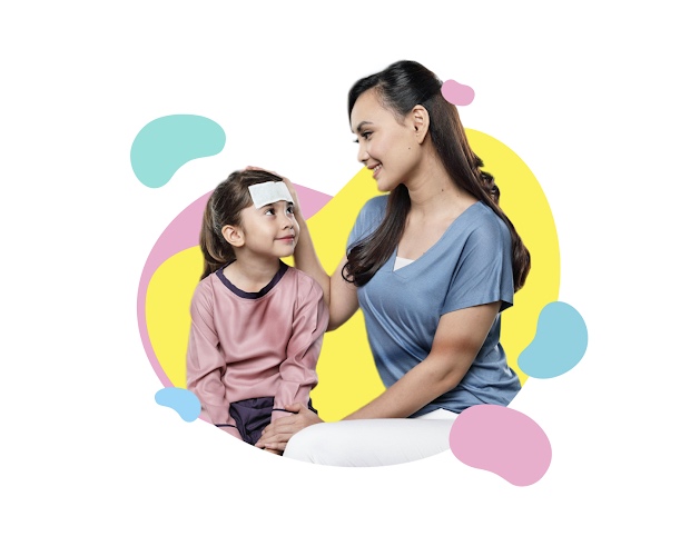
The reason behind it is how the products provide comfort through touch, just like a mother. Now a mother would do anything to comfort their children when they feel sick, but the first thing that comes to mind in communicating their love is always touch--whether it's embracing, stroking, or petting. So it only makes sense to emphasize it as ByeBye-FEVER is the "first aid" that you go to when your children have a fever.
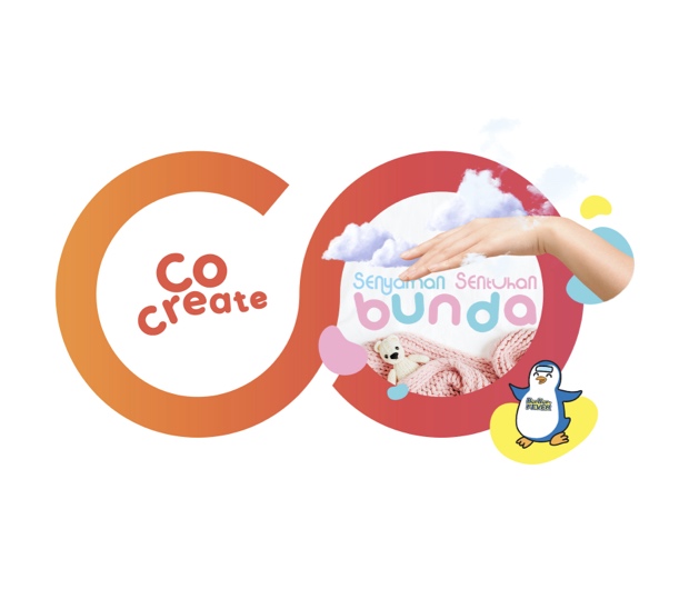
So our new communication is: "Senyaman Sentuhan Bunda" (As Comfortable as A Mother's Touch).
The Connection
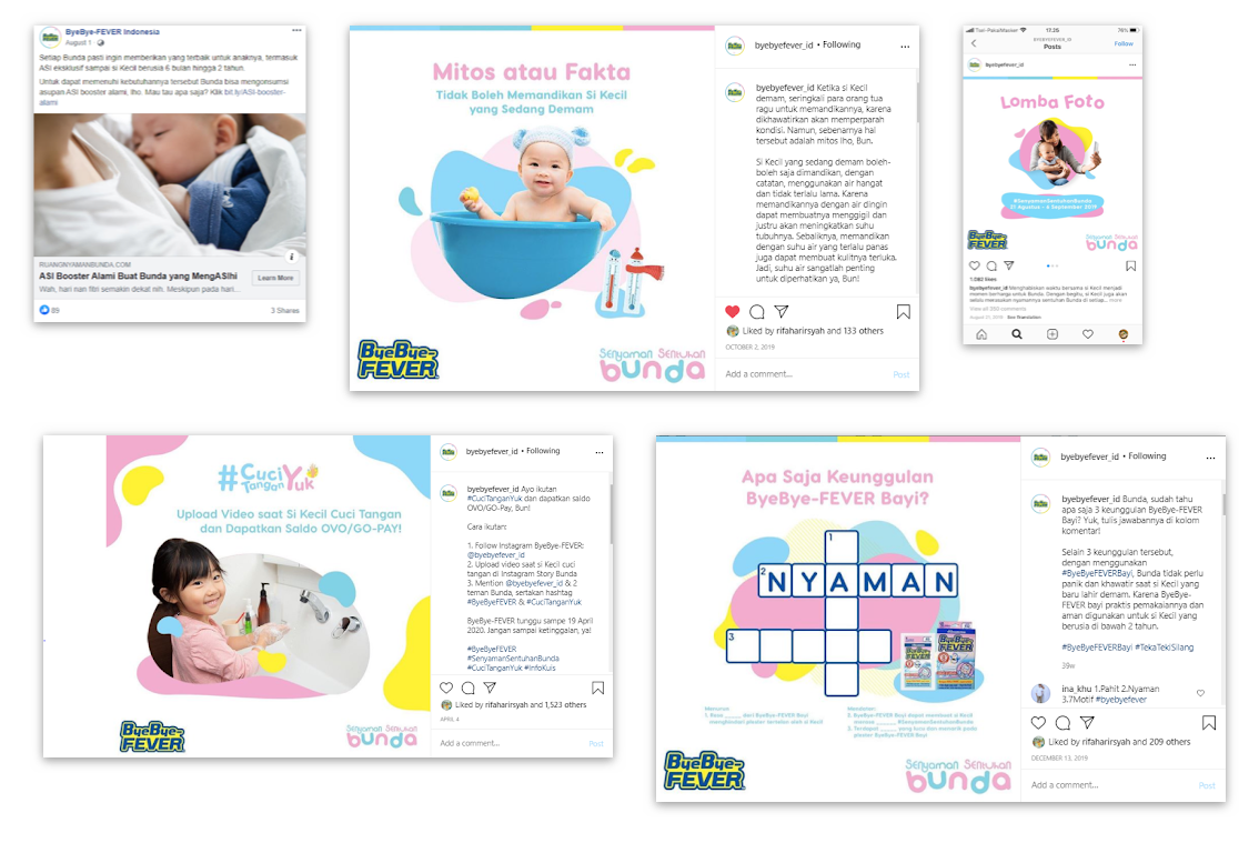
To reflect our new communication and help our client get closer to its audience, we make our content more emotional and less hard-selling by positioning ByeBye-FEVER as a trusted and reliable best friend who provides valuable, inspirational information without patronizing the audience. We identified pain points experienced by Indonesian mothers and offer solutions in three content pillars: health, parenting, and products--all of which are communicated with a conversational tone and manner to strengthen the image that we are building.
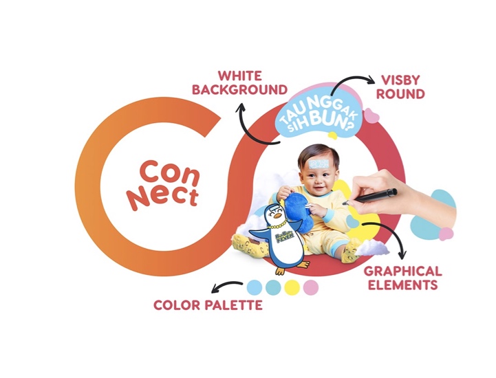
However, storytelling is not only about putting words together but also visual representations. To go with our stories, we specifically formulate a visual style that portrays our messages--from color, graphical elements to even typeface. We deliberately use white backgrounds to represent children's innocence; exclusively pick visby round font to avoid sharp edges, which could be dangerous for kids in real life; and highlights colorful fluid design to show the joy of parenting with ByeBye-FEVER. And obviously, we keep the brand's soft color palette to emphasize its identity.
The Works
Tailored By
Creative Director
Aulia Pramudana
Head of Content & Social Media
Raditya Nugroho
Content Strategist
Eunike Rina
Social Media Lead
Ditya Kusuma Dewi
Editor
Arista Prianka
Project Manager
Arinafadila Hajarrifa Harirsyahputri
Social Media Crew
Andhitta
Visual Crew
Farid, Fauzan Harifqi